
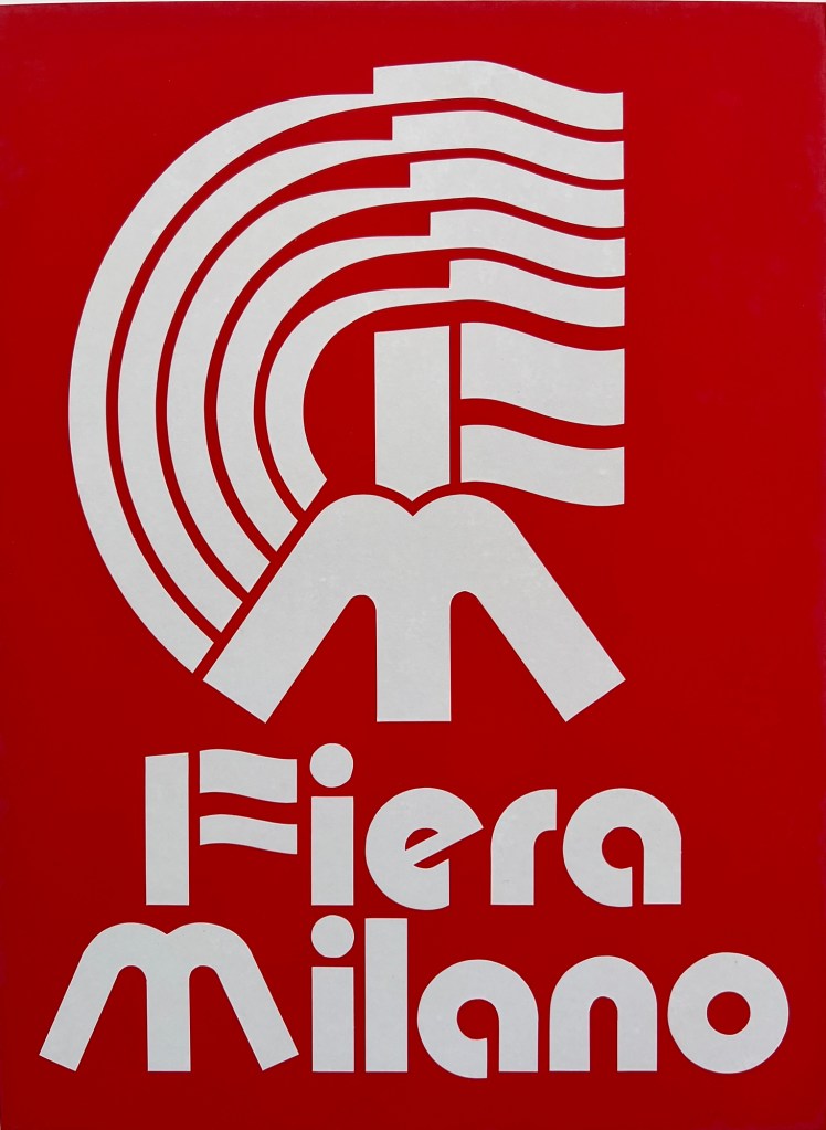
In 1986, Vlad posted his entry for the design competition of a new mark of the Milan Fair. Unfortunately, the postage arrived late, and was returned back to the sender. Therefore, Vlad never found out if his design would have been successful or not.
This was at a time when a graphic designer had to design, cut, copy and paste their designs on a clean backing. The entire logo, black and white and colours was done by hand. Skilfully cut, coloured and presented.
There was no adobe creative suite, no computers. You had to be creative, skilled and able to come up with a concept from your mind. No AI to generate your designs. Here you see Vlad’s outline design, this would be produced now as a vector illustration in Illustrator. There was no room for error. Everything you presented had to be perfect. Below you will see the written blurb for the Milan Fair design, the examples of his design on board and the airline material that was sent back.
Competition for the new mark of the Milan Fair
The design has a true international character. The Olympic colours of blue, gold, black, green and red are used to represent all nations and continents. The use of these colours culminates in the prominence of red and green in the stylised F and M and the logotype, representing the host country through colours in the Italian flag.
The curved lines end in a suggestion of the flags of all nations waving in the breeze.
Board No.1 Black and white presentation
Board No.2 Colour presentation
Board No.3 White on red (in reverse) presentation
Board No.4 Sketch and reductions
Board No.5 Alternative design sketch and reductions


Leave a comment